The Visual Arts department has proudly announced that the following students Lydia Chen, April Surac, Lucas Agcaoili, Madison Wood and Ednah Miller were chosen by the SOBO Gallery to show their work for the upcoming Top Choice High School Awards Art Gallery Exhibition. The students’ work will be displayed at Winter Garden City Hall in April and May.
Artwork by: Lydia Chen 11
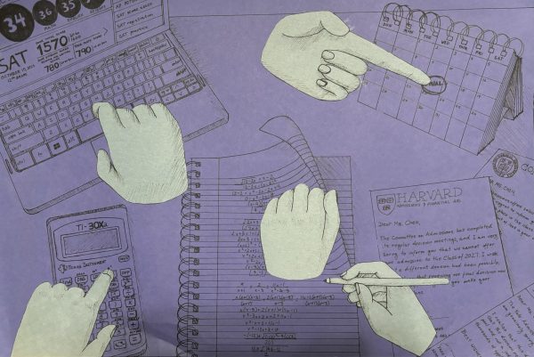
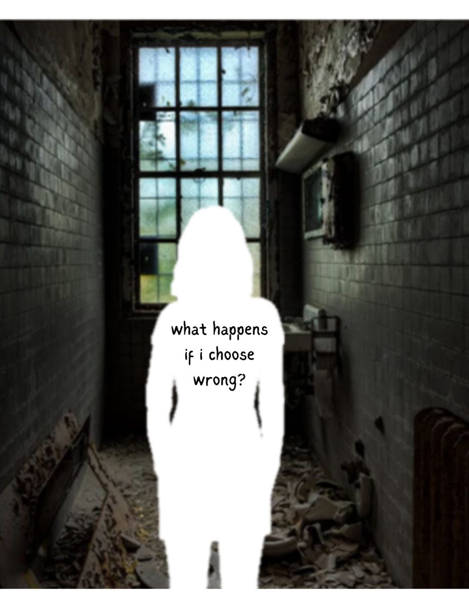
My artwork is a mixed media collage titled “Rat Race” and it’s based on my experience as a high schooler. As the oldest daughter in a Chinese family, I always had extremely high if not impossible expectations put on me, and it has taken a toll on my overall health. Especially now that I am a junior there has been a lot of pressure to perform well academically with no support whatsoever, and even though I am performing well in school it is still not enough. I wanted my artwork to capture this sense of always trying to meet these expectations and stretching yourself thin to please your family. Throughout the piece you see little pieces that tell a story of this girl who is juggling all of these different tasks and overworking herself just for it to be futile, hence the title “Rat Race”. This artwork is for those who are always running an endless, self-defeating race.
Artwork by: April Surac 10
Short Blurb:
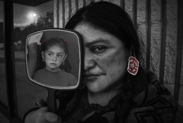
The work I showcased at the SOBO Art Gallery was a photography piece I made this year titled, “ñawpaq pacha”, where I was awarded as a selected finalist of the SOBO Art exhibit and a gold key in photography for The Scholastic Art & Writing Awards Competition as a south region winner and national qualifier.
Inspiration:
Photography is my favorite artistic medium to experiment with, especially doing editorial, conceptual, or portraiture styles of work, and this piece was an exploration of that. In particular, I wanted to capture that remaining feeling of being in touch with the past, present, and identity altogether, from a personal standpoint of my mother and being Quechua.
Tools/Materials Used:
I used a Nikon D5200 camera with a 50 mm lens to capture the main photo while the other photo was past-taken on film. In post-production, I edited the photos together using Adobe Photoshop software to enhance the result of my photos.
Time of Creation:
The creative process behind my work took around a month or so to bring to life, from ideation to execution. During the time, after I knew what story I wanted to depict in my work, I experimented with different angles, lighting, and compositions over the course of weeks. After capturing pictures, the editing process took around a couple of weeks as well, in creating differently edited photos like choosing between black and white or color, to juxtapose both elements of the present and past between the two photos seen.
Artwork by: Lucas Agcaoili 11
Artwork by: Madison Wood 10
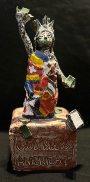
What inspired me was just watching how Americans react and respond to different countries and their knowledge about said countries. Everything I added onto my version of the Statue of Liberty has a meaning, some even having multiple meanings; the money, the cracks, her tears, and the empty book all show how I view America and our “freedom.” The flags, in particular, represent how we treat other countries and how we ignore that we aren’t even that high on different freedom indexes. As well as representing minority groups in America who are murdered just for being who they are.
To give a quick rundown of everything, the money symbolizes the gender wage gap, inflation, homelessness, and the current battle between how much money we should be spending on America. The book is purposely left blank to throw shade at the book ban we have everywhere, but more specifically in Florida. As for the writing “GOD BLESS AMERICA?” is trying to prove that it is a little silly to say that with everything that is currently happening. The whole statue gives a more updated view on America, as I don’t feel like our current statue is being held to its promise of freedom.
It took about 5-7 school weeks to make this piece, and about another 2 weeks to glaze (paint) it. I don’t remember using many tools to make this project; I prefer to just sculpt with my hands as I feel it’s more intuitive and creative!
Now I will say if I could go back and change something I 100% would. Showing more aspects of feminism, like her uterus falling out. Guns and bookbags around her to represent the acts of terrorism that happen almost every week in America yet we all sweep it under the rug because it happens so often we are just desensitized to it. However, a lot of thought was put into this piece and I am very proud that I got into the SOBO art contest!
Artwork by: Ednah Miller 12
